Table of Contents
Time for a Change?
Changing WordPress themes has been on my “to-do” list for a few weeks now, but I didn’t have a spare day to allocate to it. So I decided to devote one of the holiday days to giving my site a facelift, and just in time for 2015, here is the new look.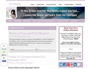
On the left is what my blog used to look like (courtesy of WayBackMachine.org) and what you see now is the result of my change.
Why Did I Change?
The main reason was that my earlier theme “said” it was responsive (displays correctly on a mobile device), but when I checked the mobile view on Matt Kersley’s Response Checker, and on my phone, it looked awful. Check your own – I was surprised!
Thanks to Tim Bonner for introducing me to Matt’s resource, and spelling out the problems of not having a mobile friendly site.
So for instance Tim says….
If you don’t provide your mobile visitors with a good experience though, Google will demote you in the rankings. Thanks Google…
The second enhancement I wanted was to be able to see snippets of several posts and one standard sized image on the home page, rather than just one long post. I know that “More” would have sorted it – but I kept forgetting to do it, and on some themes I’ve tried, the images varied or were absent from the “preview”.
I also had one or two other little irritations with my earlier theme – the links didn’t show up well enough and every so often there was some other glitch that took a while to fix, and it was – apparently – no longer supported.
But overall I was quite fond of it, and had it not been for the responsive issue I doubt I would have bothered to make the move.
Improvements From The New Theme
The new theme is from InkThemes and it came as a bonus when I purchased a copyright free image finder from Enstine Muki. I haven’t got round to using that yet, because this “responsive site” issue was upper-most in my mind. However, if Enstine recommends it, I’m sure it will be good.
- The most important theme “gain” to me was the responsive issue. With the previous theme, the user needed to scroll horizontally on some mobile devices, which is “not good”. Now, “vertical scrolling” is all that’s needed.
- Now when I display JoyHealey.com – as opposed to an individual post – I see an image and the first few words of several posts, rather than the whole of one post. There’s also the option to display a home page with sliding images, but for the moment I prefer the range of posts. Showing several post previews was something I had wanted to do for a long time, but it eluded me with the original theme.
- My links are now blue (rather than pale pink) so they stand out better,
- More footer widgets, which hadn’t been a worry for me.
- Because it’s a premium (paid for) theme I also get support and a user forum. Haven’t tried these yet, but they might give me chance to feed back some of the issues I’m feeling I’ve lost.
Changes Not To Do With The New Theme
The Table of Contents Box at the top is nothing to do with the theme – it’s a free WordPress plugin by Michael Tran. I’d seen it used in other posts and quite liked the idea. It’s more useful for longer posts than this one, and it has applied itself retrospectively with no issues that I’ve noticed. The plugin also produces “human” site maps, but I preferred my existing site map, so didn’t change that.
Likewise some of the new widgets (tabbed and optin box) came from the Instabuilder plugin. Rather irritatingly at the moment the optin text is right-justified and I can’t see why! (Update: Thanks to Harleena and Vinay for patiently walking me through fixing this problem, as you’ll see in the comments!)
What Have I Lost?
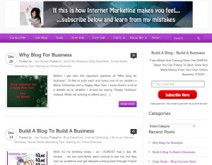
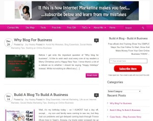 The most obvious thing that has changed is a lack of “pinkness”. Some may say the earlier site was “too pink”. Perhaps it was 🙂 but it was “my pink” and I liked it. However I noticed other sites going for a cleaner “look and feel”.
To get more pink I could easily change the colour scheme with the new site, the most obvious manifestation of it being the horizontal bar under the header, but there are only 11 colors to choose between and “my” pink isn’t one of them!
The closest alternatives would be purple (on top) or “their” pink (under the purple), but they’re both a bit vivid for my liking. So I stuck with blue, as you can see from the bar at the top.
Anyway – looking closely – the clickable links seem to match the color of the horizontal bar, so if I went back to the original pink it seems I’d be back to pink links, which were too faint to see, when I want blue links!
I think the blue has grown on me, because it still matches my header 🙂
In one sense it’s a fuss and flap over “nothing”, but if potential clients can’t find the link to click…..
Another thing I’ve lost is the bigger selection of social media “follow me” links I had before. Now there is just Facebook, Twitter and RSS (plus some I don’t use, like Yahoo) at the very bottom of the site vs “more” on the original site – including Pinterest, Google+ and LinkedIn. I found a plugin to put some of the others in – but it didn’t include LinkedIn and I was trying to remove plugins, not add them 🙁
I also lost a menu – the original theme supported two menus, this one only has one, but as they can be nested I don’t mind. I WAS feeling that I was making too much of the Cookies, Privacy and Compensation Disclosure pages. Now they’re all in one place.
Verdict?
Changing WordPress themes didn’t turn out to be as easy as I’d expected – because I took for granted that the new theme would have certain features that seemed pretty basic. And It came as a surprise that they weren’t there.
However, given that I have this premium theme (Bizway Pro) as a “free bonus” and it’s responsive (until some clever reader tells me it’s not) I’m happy over all, despite my few complaints above.
It’s fixed my three major complaints about the old theme, so I’ll run with it for a while.The cost wasn’t actually the issue, and I had my eye on a more expensive one until this dropped “free” into my inbox. I wanted my major complaints fixed at all costs, and now they have been.
I know there are themes that would give me more control, but I’m not looking for “complicated”. For instance I tried Genesis with a child theme once but never got to grips with it and just threw it away in the end. This theme was simple enough to learn and I made all the changes within the time I had allowed myself (plus a few tweaks from friends who helped out with bits I couldn’t figure out myself!)
Hope you think the new look is a step in the right direction, rather than a step backwards. If you see any essential feature missing, please let me know in the comments below. It’s easy to get “too close” to your work, and nothing is yet cast in stone….
Have a Happy and Prosperous New Year!
